RAC
Highlights from my design work at RAC
Summer prize draw
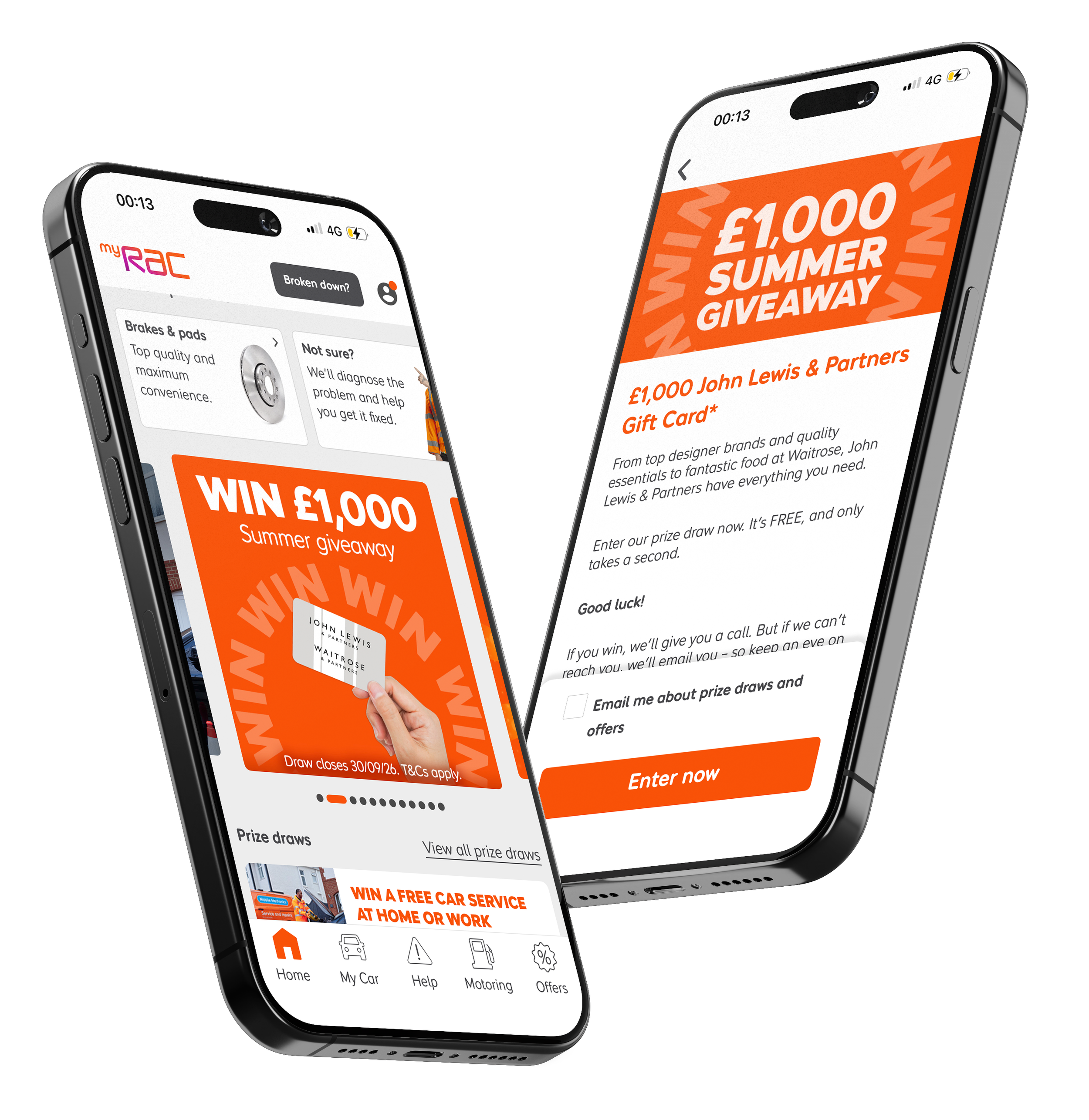
For this project, I redesigned the RAC Summer Prize Draw visuals to create a cleaner, more focused layout with fewer gift cards competing for attention on the myRAC app. I used bold, flexible typography that can be easily adapted for future seasonal campaigns, ensuring consistency across multiple touchpoints including the myRAC app, email communications, and web. To increase engagement, I developed the design as a GIF, adding movement to attract customers and strengthen visibility across digital platforms.
Youtube
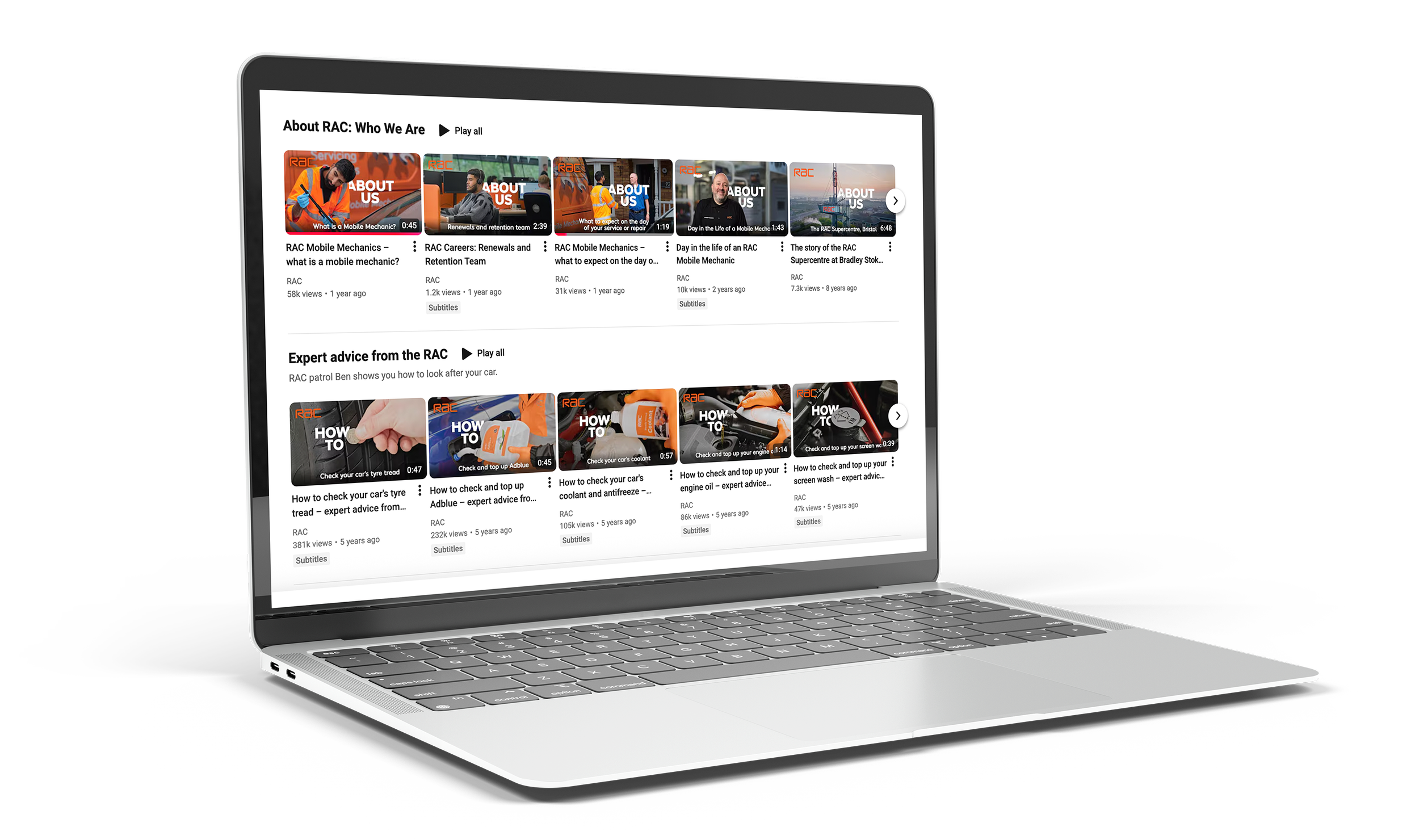
I designed the YouTube thumbnails to be bold, consistent and instantly recognisable, using strong typography and a clear, repeatable layout that stands out against other content. Each thumbnail features a fixed logo position to strengthen brand identity and make the series easy to identify at a glance. The designs are built as adaptable templates, allowing future videos to be updated quickly while maintaining a cohesive visual style across the channel.
Roadside leaflet
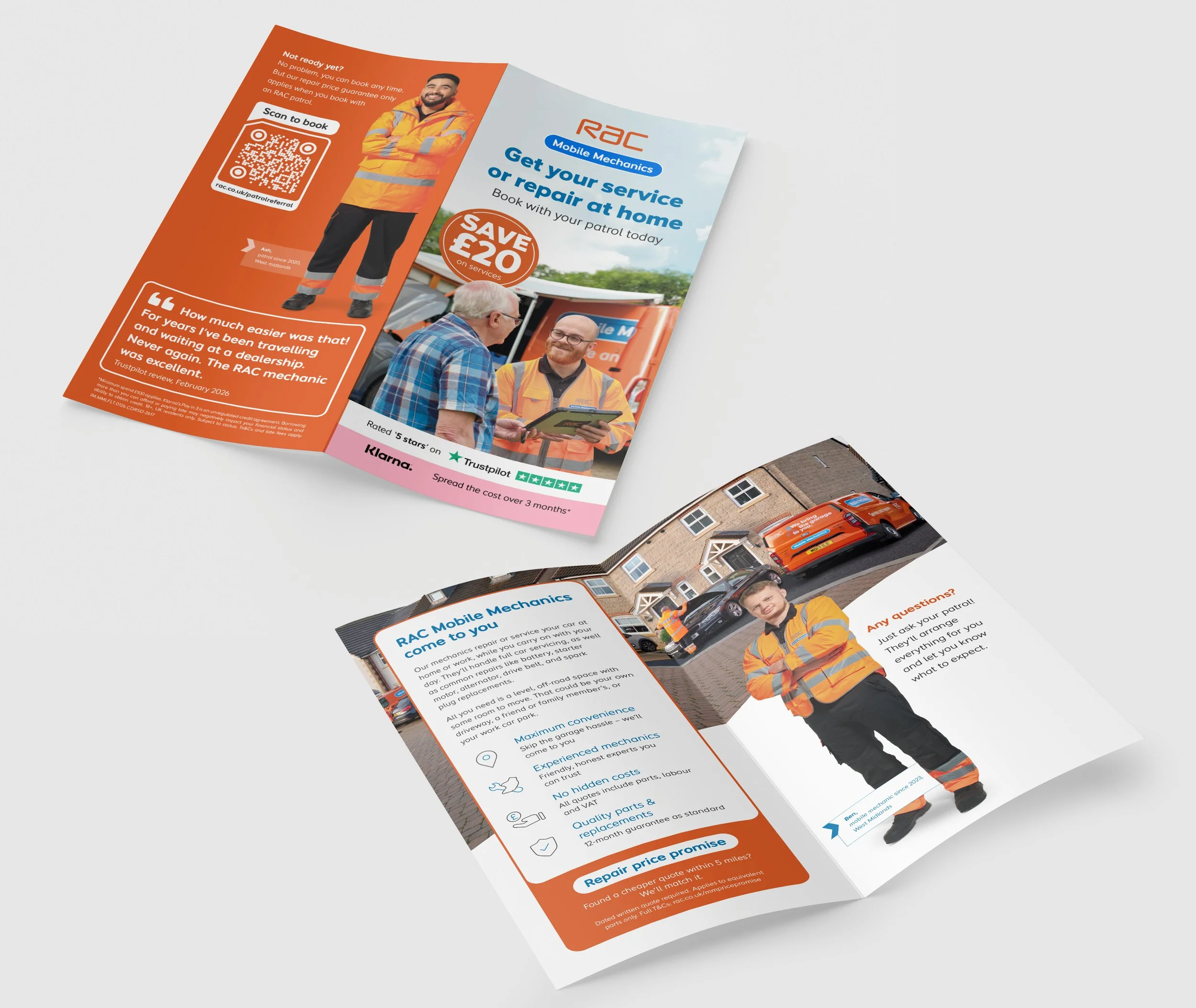
I was part of the team who designed a roadside leaflet for our patrols to hand out to customers, promoting our mobile mechanics service in a clear, engaging and easy‑to‑understand format. I explored multiple design routes to find the strongest balance between bold messaging and practical usability, presenting options to fellow designers and refining the layout through collaborative feedback. The project involved regular meetings with senior stakeholders, as well as close teamwork with senior designers and the artworker to ensure brand consistency. The final leaflet is both visually confident and functional, giving patrols a reliable tool to communicate our mobile mechanic offering directly at the roadside.