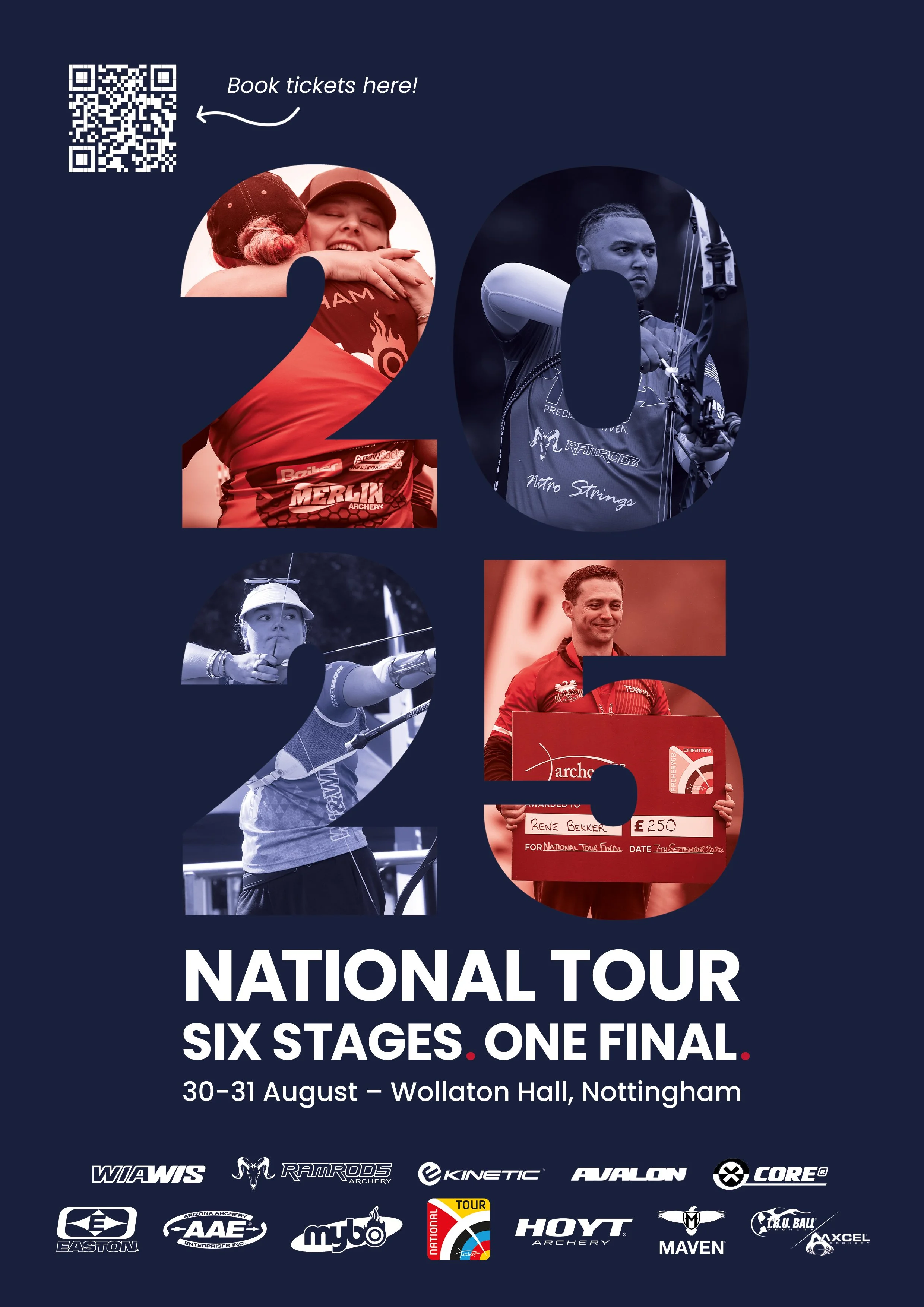
Archery national tour
Conceptualised and designed a visually striking ad and graphic for the Archery National Tour
and it’s Final, aligning with Archery GB’s brand identity while introducing dynamic new visuals
to attract younger audiences.
National Tour final Ad

I added the QR code so it was easy to book the event. This was a fun and open brief I was passionate about, having been to the event many times, it deserved an ad which displayed the talent involved.
I designed a promotional ad for the National Tour, capturing the intensity and precision of competitive archery through bold visual and strong typography. I used imagery from last year’s finals and their iconic red and blue to stand out as a social media square or printed poster. My main ask was to create an ad aimed at archers, showcasing the national tour final – the peak of the UK season, as well as advertising the companies sponsoring the event.
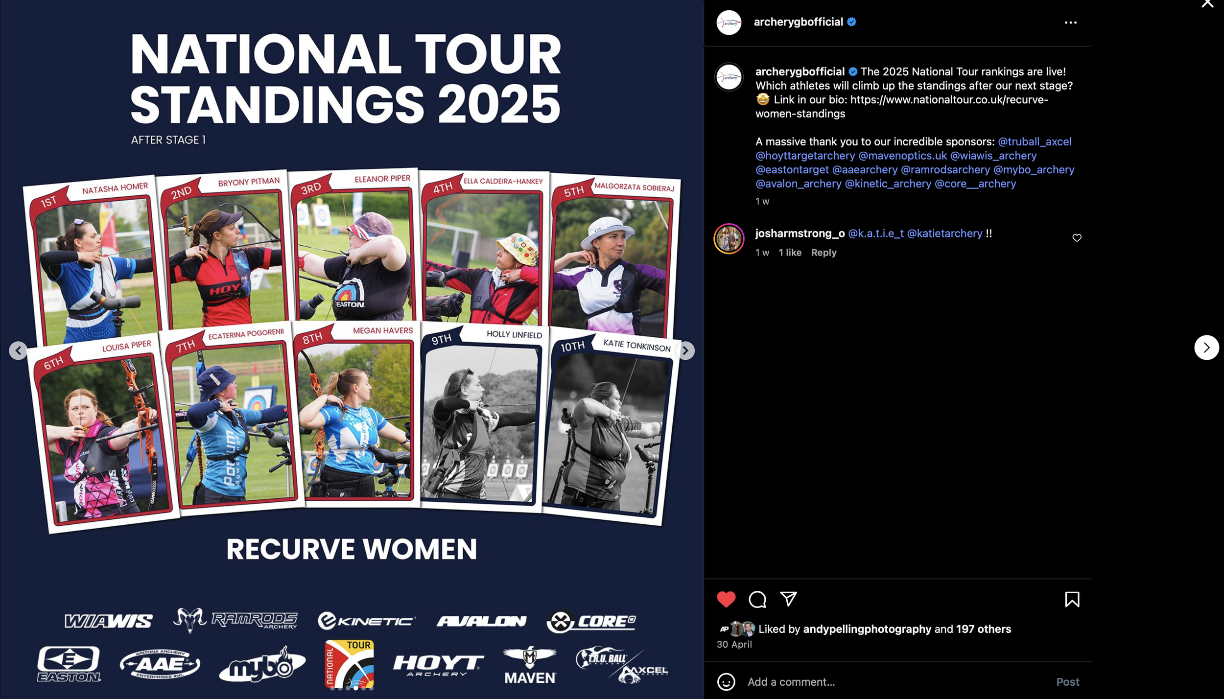
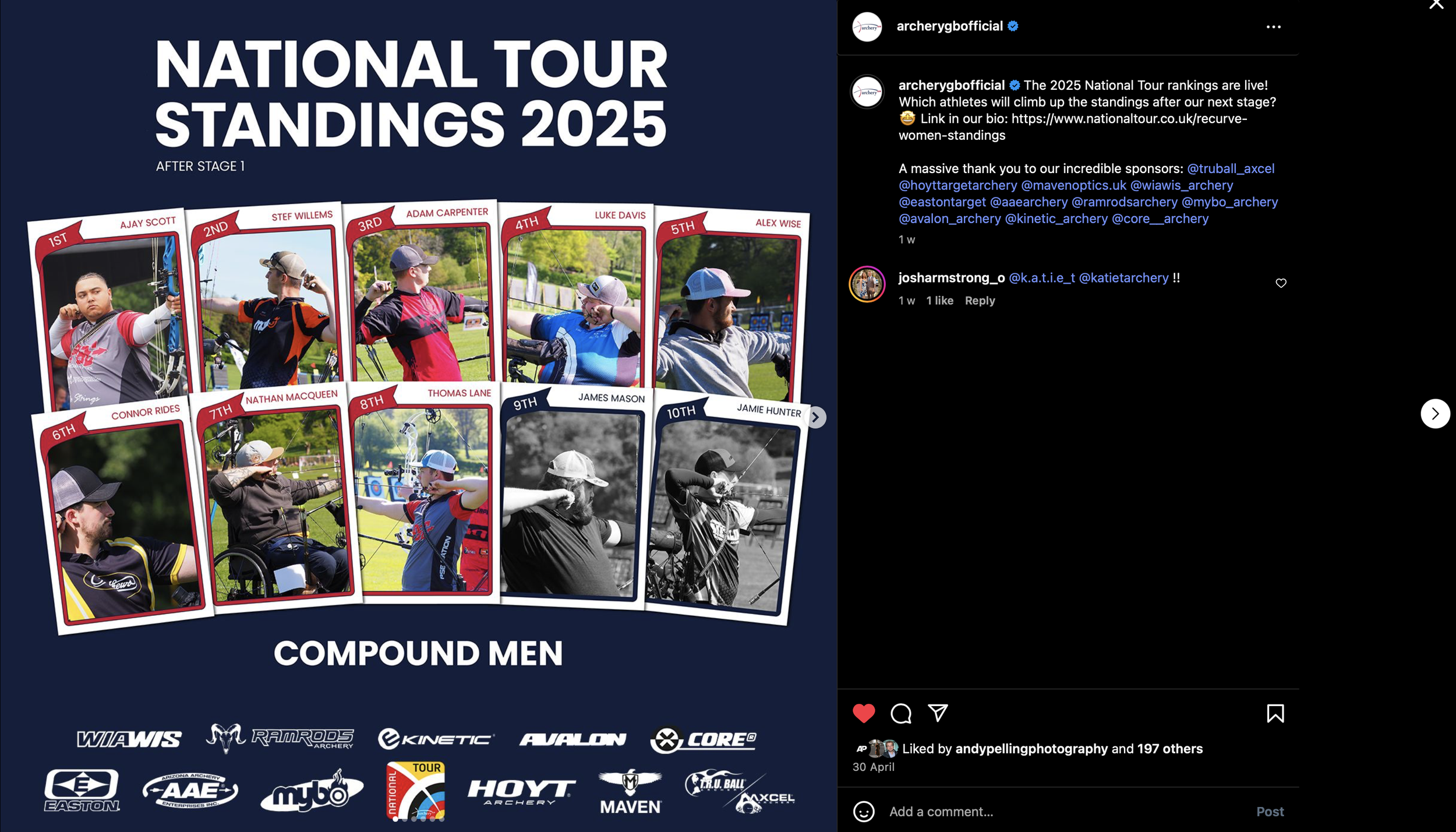
National Tour standings
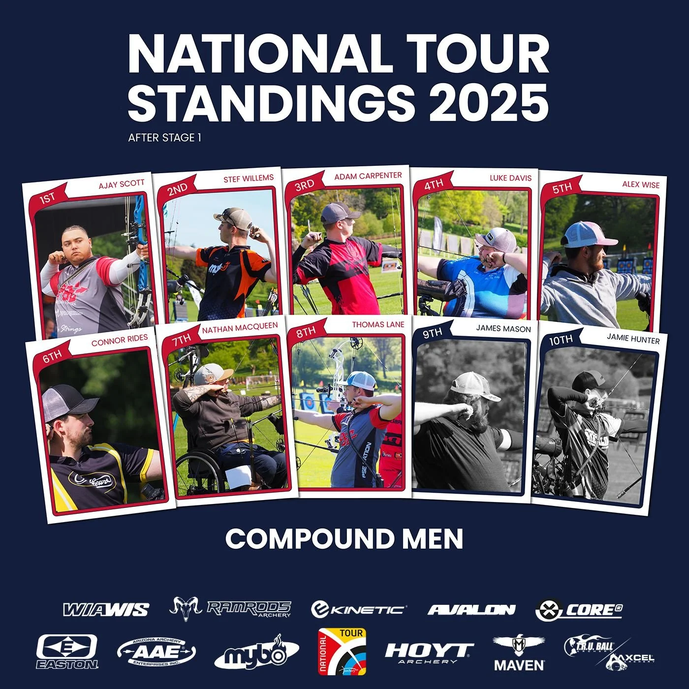
The purpose of this graphic was to allow for quick and easy updates after each event stage. The design was built with flexibility in mind – images and names can be swapped out swiftly, enabling standings to be updated and published to social media as soon as results are available. It was made for 6 different categories.
I crafted a branded standings board for the Archery National Tour, integrating official colours and fonts to align with the tour’s visual identity while maintaining user-friendly design. I wanted to make something fun but easy to understand while showing the same sponsorship logos as the finals ad.
I wanted to do something fun and not done before, the only ask was to show the archers after each stage, easy to change and for the bottom 2 to be ‘greyed out’ so it’s clear the top are the up to date finalists.